

CINEPLEX®
BRAND REFRESH
OBJECTIVE
After years of adding programs and complicating the lookfeel, Cineplex was at a point where they needed to simplify and reign in the brand guidelines. A streamlined refresh was needed to take control of the brand's equity in the Canadian market, and so our team embarked on a weeks-long exploration into what the new Cineplex would look like.
SOLUTION
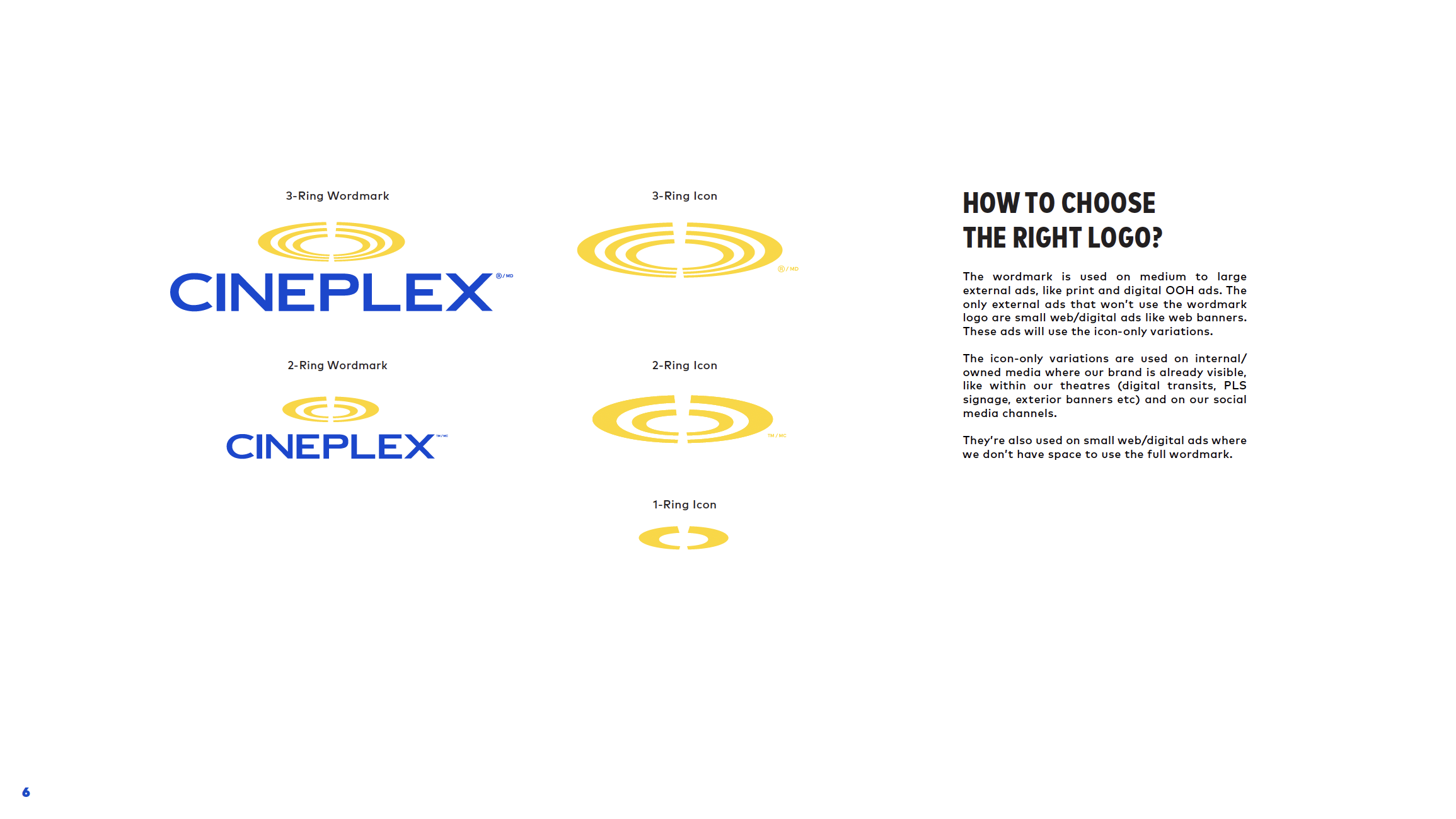
We identified several areas that needed refinement; the logo needed modularity and flexibility, the palette needed paring down, the font system needed to be clearly defined. Each subbrand within the Cineplex ecosystem was using a different style and it was clear that they all needed to come into alignment.
RESULT
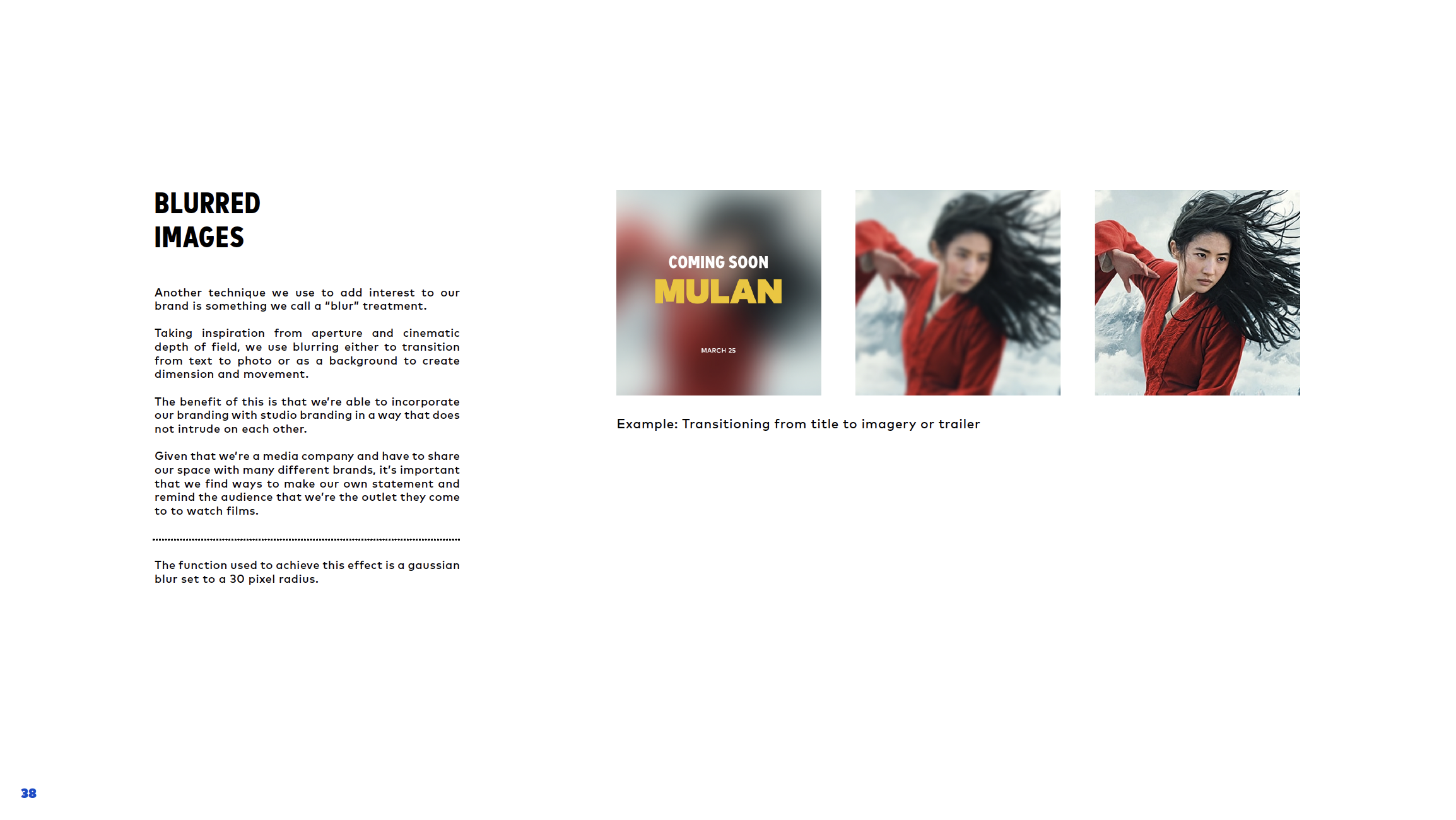
A new fully fleshed out brand deck, equipped with a new font system, icons, illustration style, and everything else required to ensure the brand retained consistency and stayed true to it's iconic roots.
CREDITS
Design & ADs: Andrea Zadro, Carolina Sattie
CD: Mike Lucas
Photography: Andrew Grinton (Coup & Co.)
